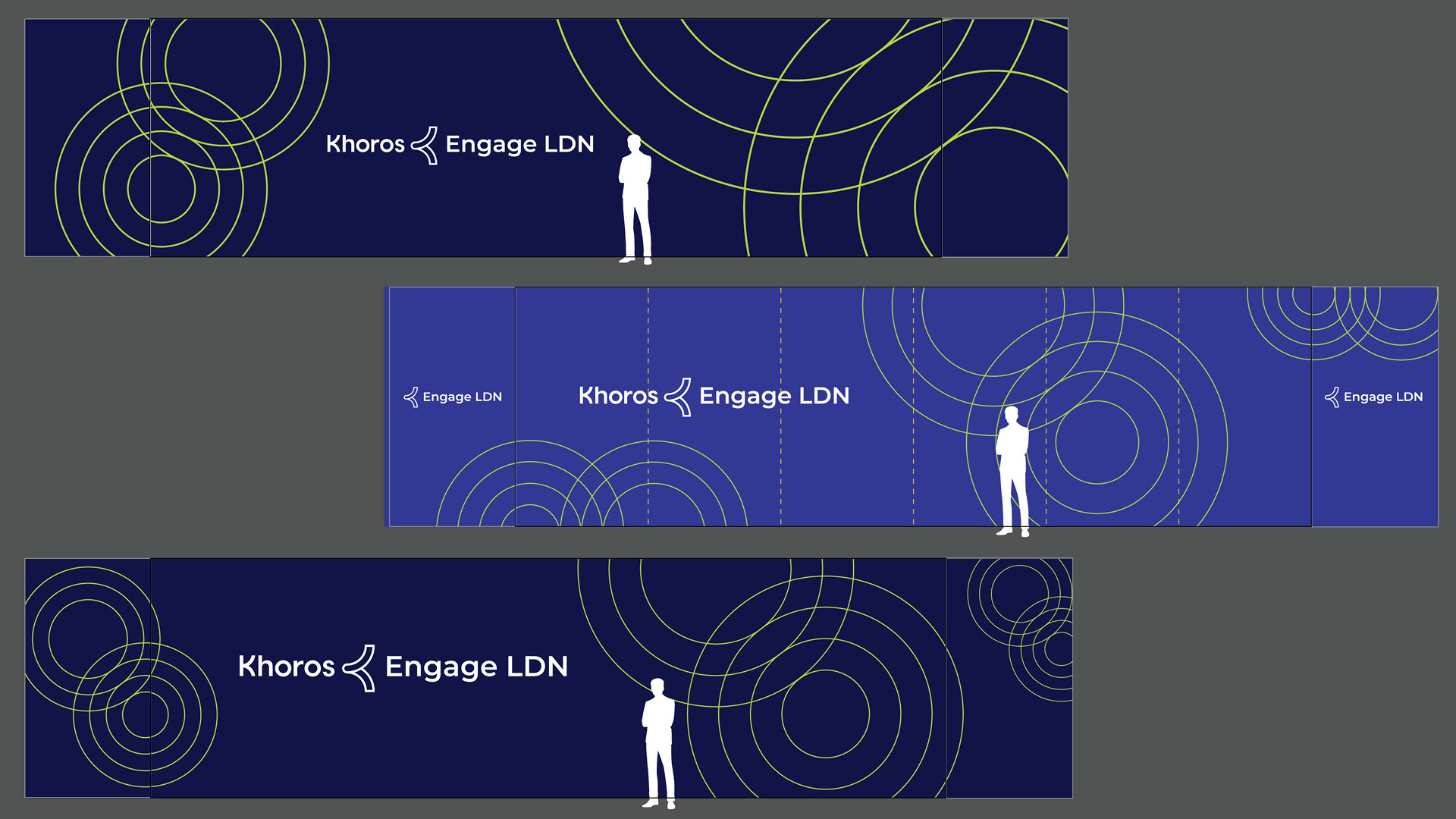
Main Stage Design:
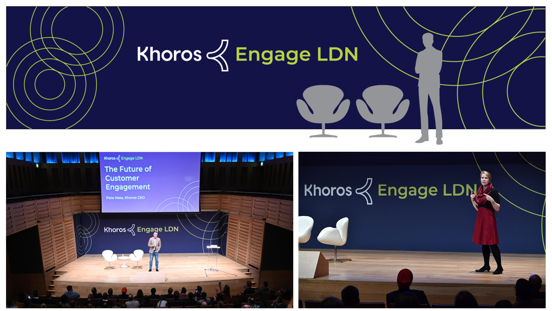
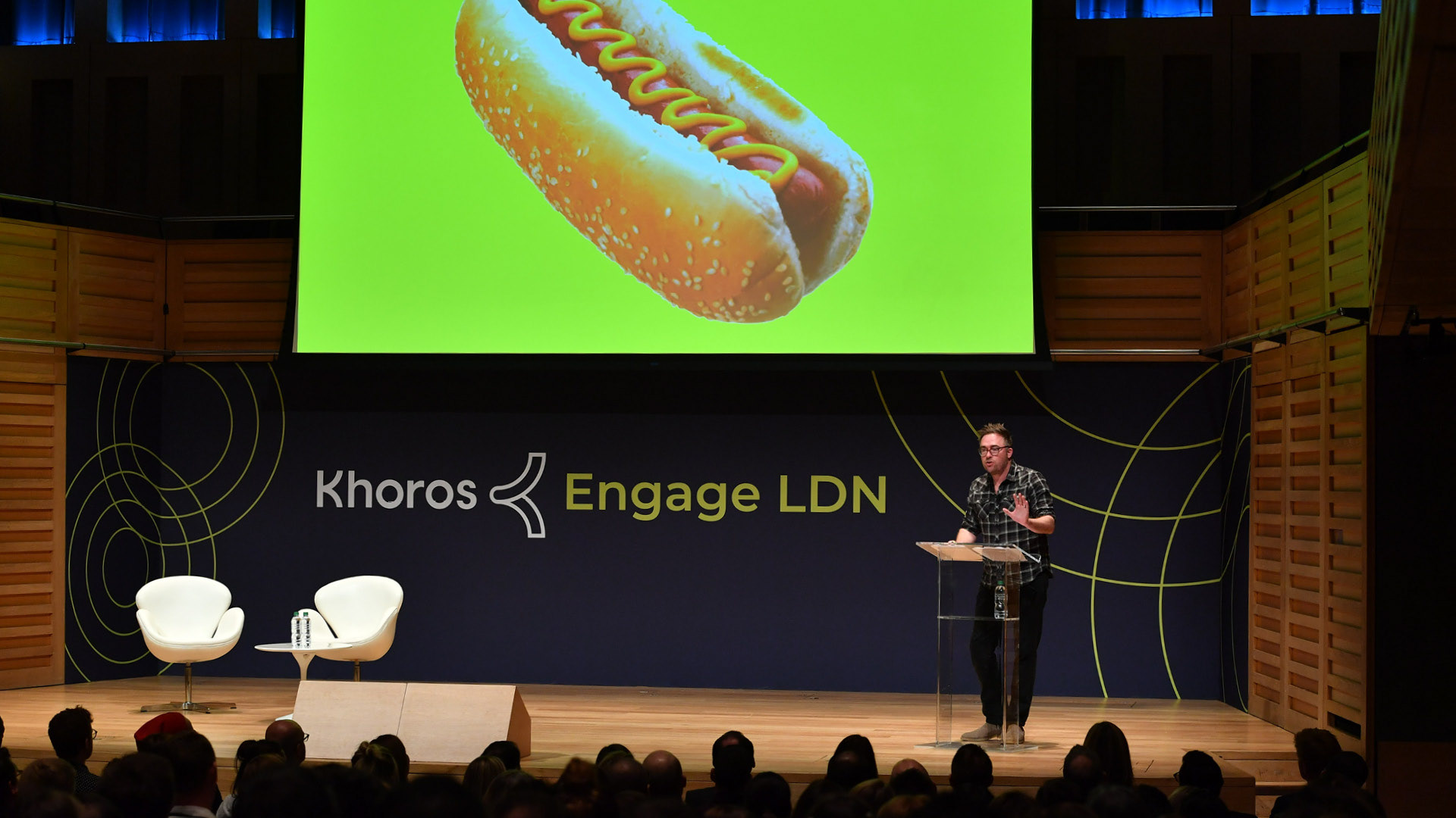
We were holding our event in a venue that the Spredfast events team had used previously, so we were able to get great insights and data from them on things likes lines of sight, lighting, signage placement, customer feedback and so on to inform design decisions. For the Main Hall, we wanted a strong backdrop that gave clear emphasis to the branding, while letting the abstracted circular "ripple" pattern set in chartreuse to create strong visual contrast. We knew that while we were primarily designing for the event experience, we also wanted dynamic visuals that would read in photography which would be important to use for future promotions.
All event photography by Arnaud Lerondeau
Alternate Explorations for Main Stage
One of the biggest challenges with designing for this event, was that the brand toolkit was weeks old when I started and there was a lot of uncertainty around how we wanted to use large primary and accent colors together. Our Primary Blue, is the lighter Cobalt-like blue (2nd image), but during the process, I was able to show that the dark Navy with the bright accent color had more contrast and visual character so we chose that direction. The design team agreed to use this convention going forward for the Engage series using Fuchsia and Cerulean against the Navy for future events in the series.
One of the biggest challenges with designing for this event, was that the brand toolkit was weeks old when I started and there was a lot of uncertainty around how we wanted to use large primary and accent colors together. Our Primary Blue, is the lighter Cobalt-like blue (2nd image), but during the process, I was able to show that the dark Navy with the bright accent color had more contrast and visual character so we chose that direction. The design team agreed to use this convention going forward for the Engage series using Fuchsia and Cerulean against the Navy for future events in the series.
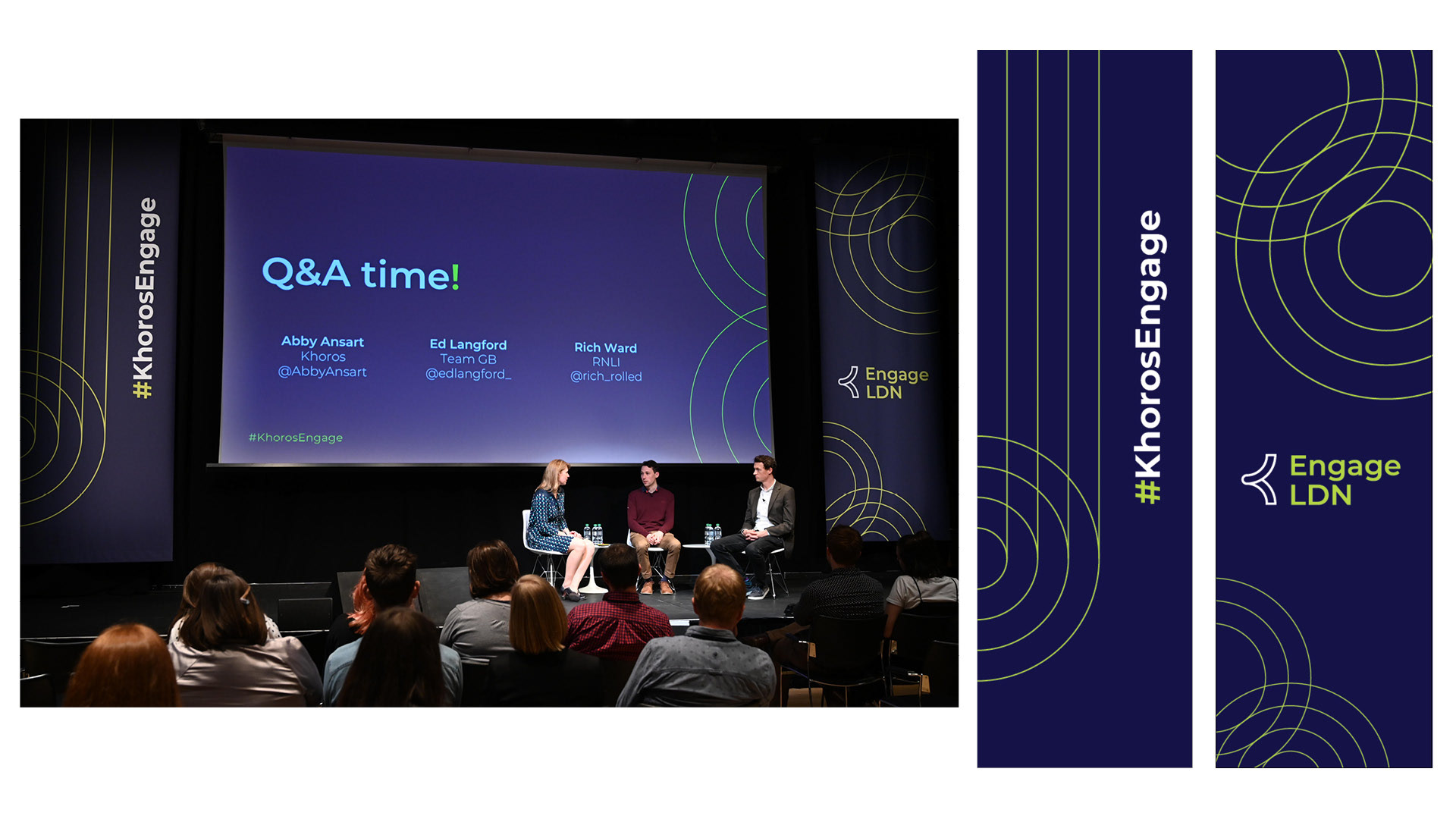
Hall 2 Stage Design:
This space was to be used for breakout sessions and panel discussion. The presentation screen was the main centerpiece, So i designed these two vertical banners to frame it with our brand. It was the first instance where the need for a more compact, stacked Engage lockup was used.
This space was to be used for breakout sessions and panel discussion. The presentation screen was the main centerpiece, So i designed these two vertical banners to frame it with our brand. It was the first instance where the need for a more compact, stacked Engage lockup was used.
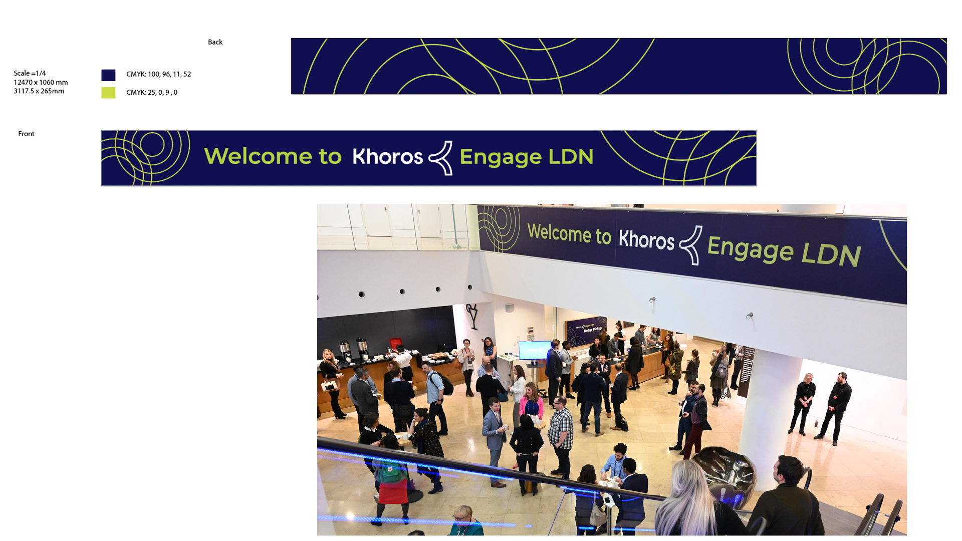
Lobby Balustrade Design
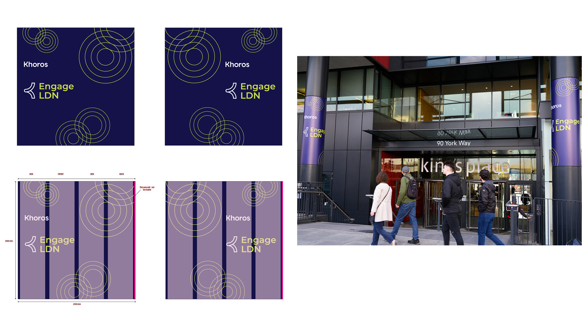
Exterior Columns Signage Design
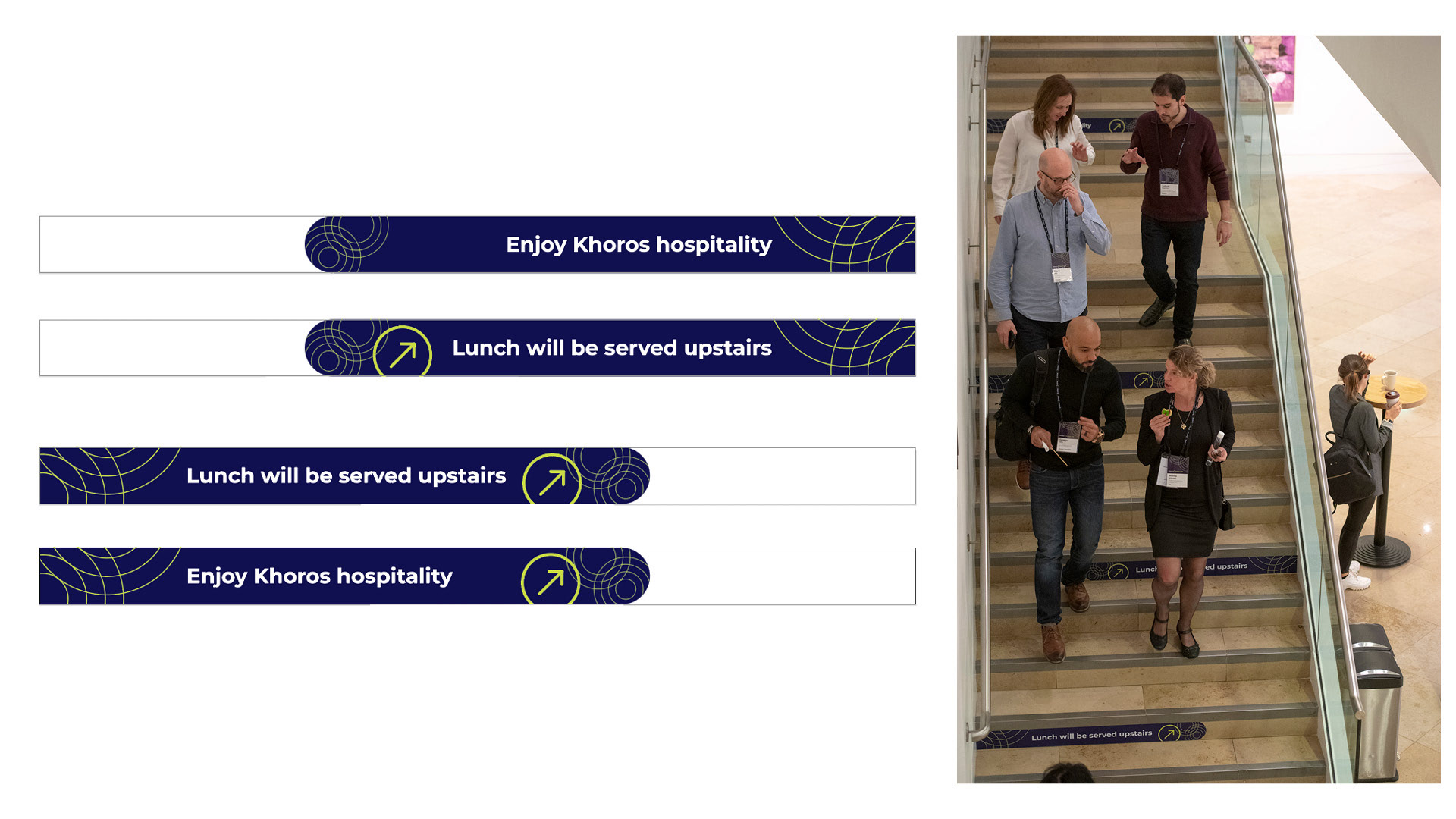
Staircase Directional Signage
This was an interesting last minute add to our signage system. The events lead made a suggestion to use vinyl graphics on the steps after seeing another event do something similar in the space. We were limited with our opportunity for signage to direct attendees upstairs for lunch and cocktails, so the stair graphics became a key component of our way finding signage system. I repeated the simple messaging up the stair case and only covered 3/4ths of the available stair in vinyl to give some contrast against the natural stone.
This was an interesting last minute add to our signage system. The events lead made a suggestion to use vinyl graphics on the steps after seeing another event do something similar in the space. We were limited with our opportunity for signage to direct attendees upstairs for lunch and cocktails, so the stair graphics became a key component of our way finding signage system. I repeated the simple messaging up the stair case and only covered 3/4ths of the available stair in vinyl to give some contrast against the natural stone.
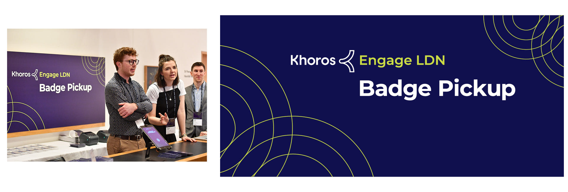
Registration Desk
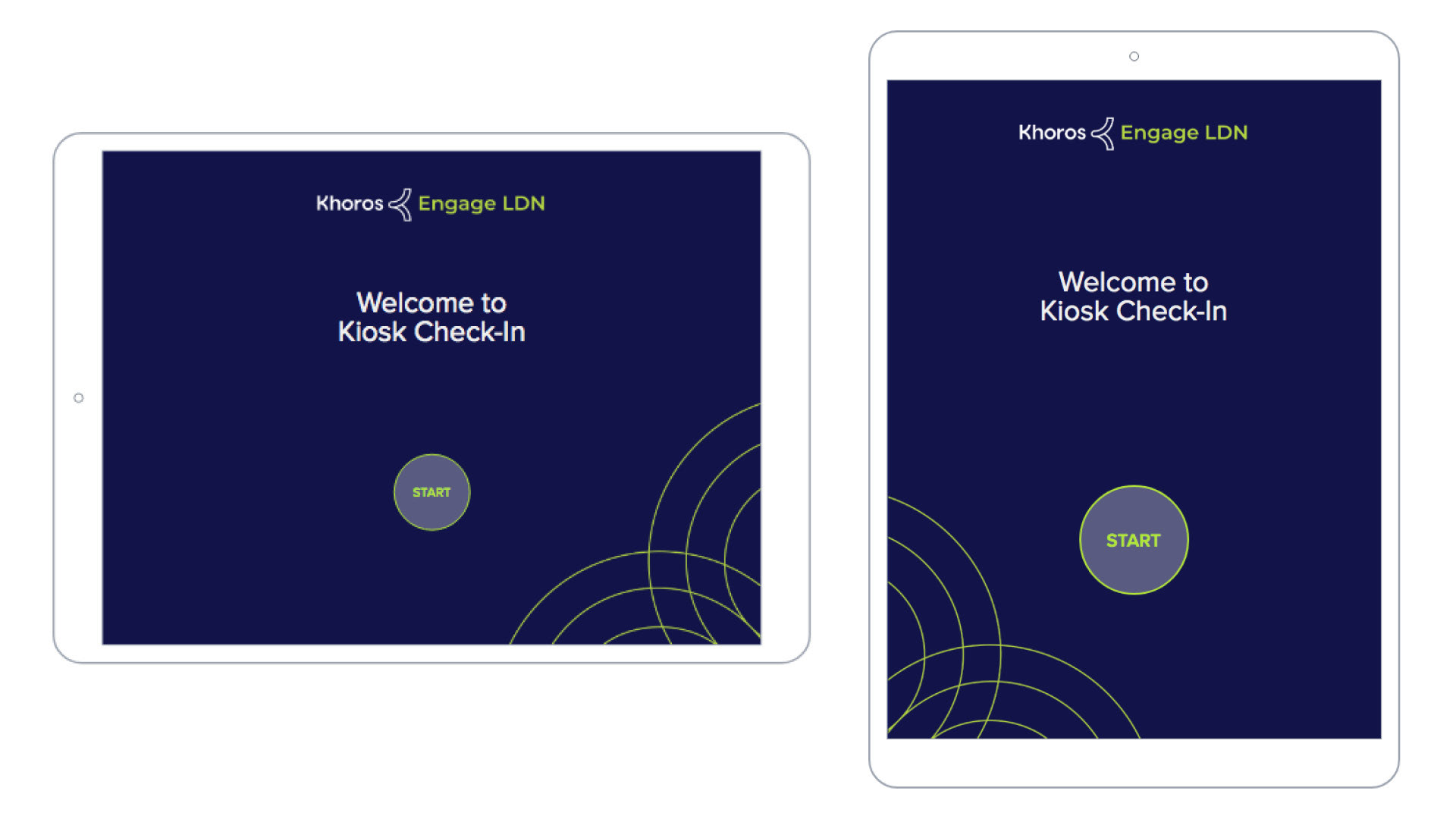
Registration Digital Kiosk (iPad)
5x7 Printed Event Agenda
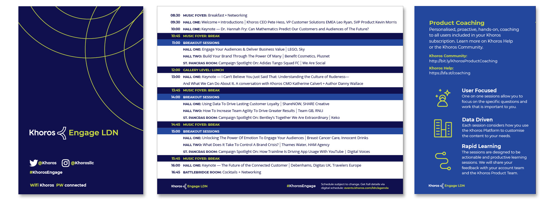
This was one of the first pieces that I designed for the event and served as an important exercise for the design team. I had started this piece during our rebrand period, during our design sprints to help figure out typography. We had our basic display typeface, Montserrat, but still weren't sure on body copy applications yet. It was one thing to use greek text when designing a brand, but getting into the nitty gritty details and stress testing with actual copy in a small space is a great way to see what your type can do. I tested a half dozen different typefaces including Montserrat, and we finally arrived on Open Sans being an ideal complimentary body copy typeface for our uses. It's interesting in how small pieces can become an important in shaping a brand.
This was one of the first pieces that I designed for the event and served as an important exercise for the design team. I had started this piece during our rebrand period, during our design sprints to help figure out typography. We had our basic display typeface, Montserrat, but still weren't sure on body copy applications yet. It was one thing to use greek text when designing a brand, but getting into the nitty gritty details and stress testing with actual copy in a small space is a great way to see what your type can do. I tested a half dozen different typefaces including Montserrat, and we finally arrived on Open Sans being an ideal complimentary body copy typeface for our uses. It's interesting in how small pieces can become an important in shaping a brand.
Digital Signage
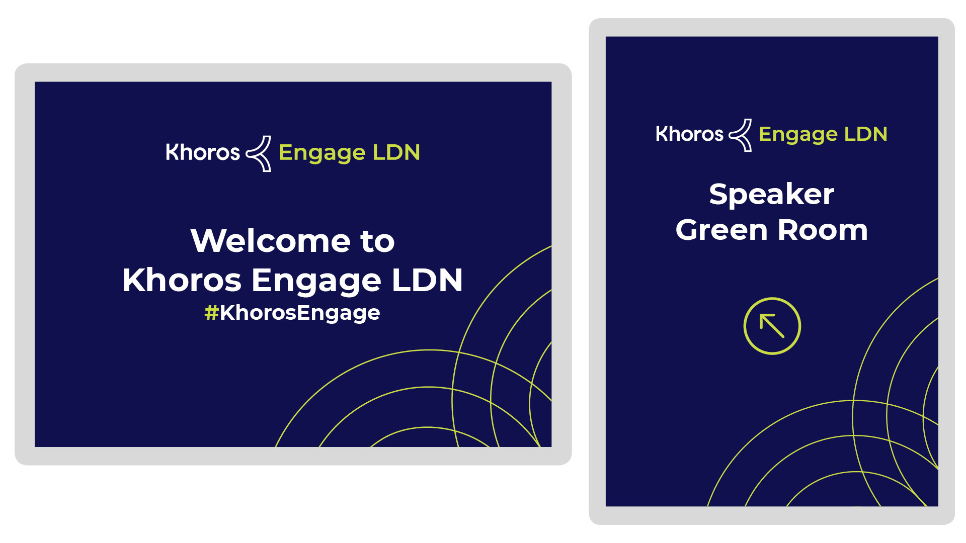
We had opportunity to utilize digital signage around the event space, and chose to use it for announcements, directionals and agenda updates. I found this was also a good opportunity to break out of the Chartreuse on Navy and introduce some of our other base colors, such as Khoros Blue and White. This provided enough design contrast to make things lively and interesting.
We had opportunity to utilize digital signage around the event space, and chose to use it for announcements, directionals and agenda updates. I found this was also a good opportunity to break out of the Chartreuse on Navy and introduce some of our other base colors, such as Khoros Blue and White. This provided enough design contrast to make things lively and interesting.
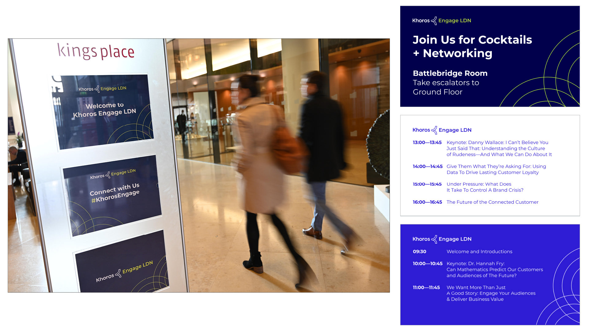
Printed Directional Signage