
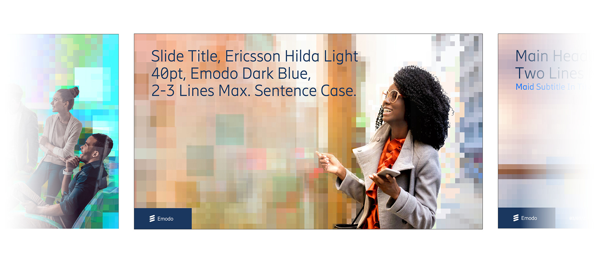
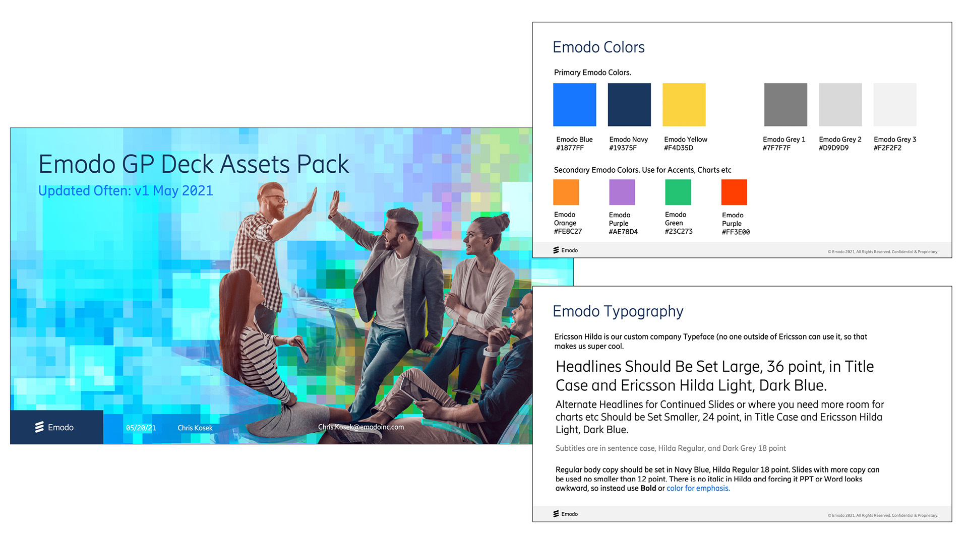
The Emodo 2021 rebrand came about from the need to reposition the Ad-Tech brand and product offerings around the COVID recovery. A big theme was bridging the digital and physical worlds. I designed a concept. around the idea of pixelated world with a clearly defined subject as the focus. This simple visual treatment illustrates the concept of bridging the digital and physical worlds while conveying ideas of optimism, energy and life. It reinforces the narrative that our targeted audiences and inventory are about people doing things out in the world, not just a collection of data points. The pixels also represent the idea that the world is murky. Our surroundings, particularly these days, are often in a state of flux. But through our lens, the audience is the focus. The audience is crystal clear.
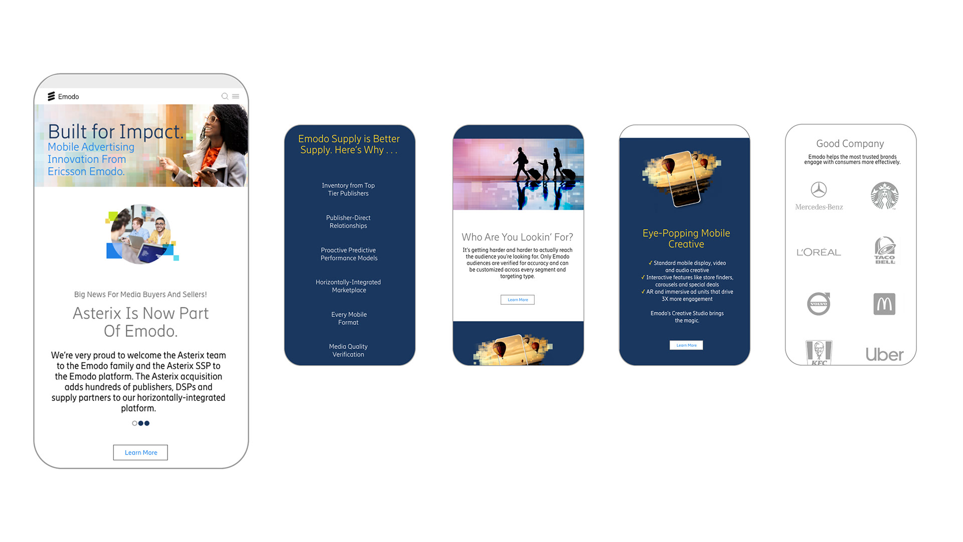
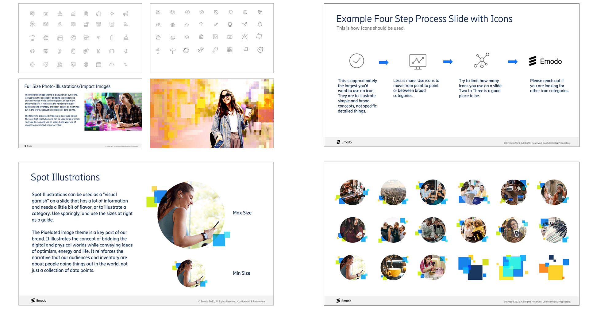
Website: Our main representation of our brand targeted at Media Publishers, buyers and Ad Agencies. Our customer base is desktop first, and we built a site highlighting the nuances of our offerings. The Art Direction of the pixelated image concept was based around the idea of "real people, out doing stuff". Our main product is curated advertising audiences and inventory, I made a conscious choice to focus on the everyday activity over people using devices since it can be assumed that just about everyone has a mobile device and that is the least important part of what we are offering. To supplement the main hero image treatment, I created a set of smaller circular lifestyle images with simple pixel "garnish". This not only allows more variety, but gives more specificity than broader hero images.
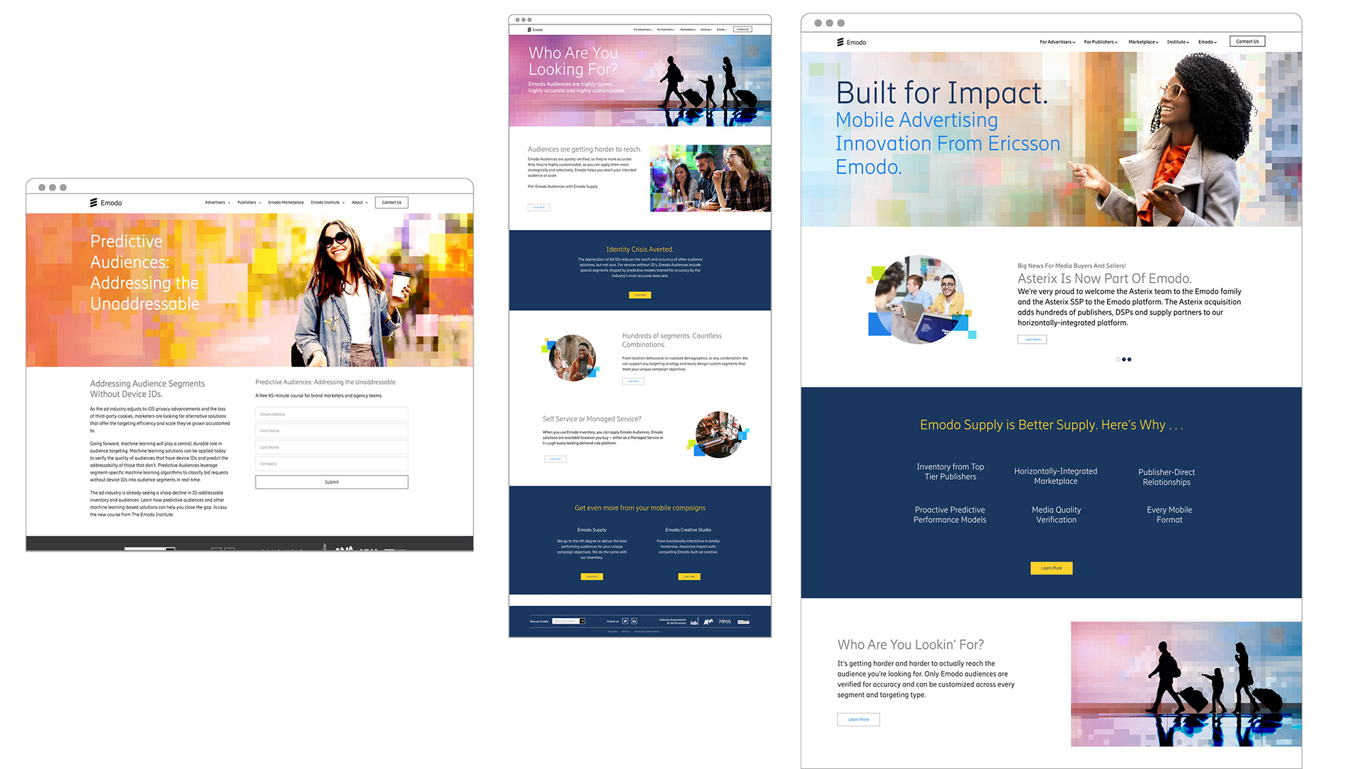
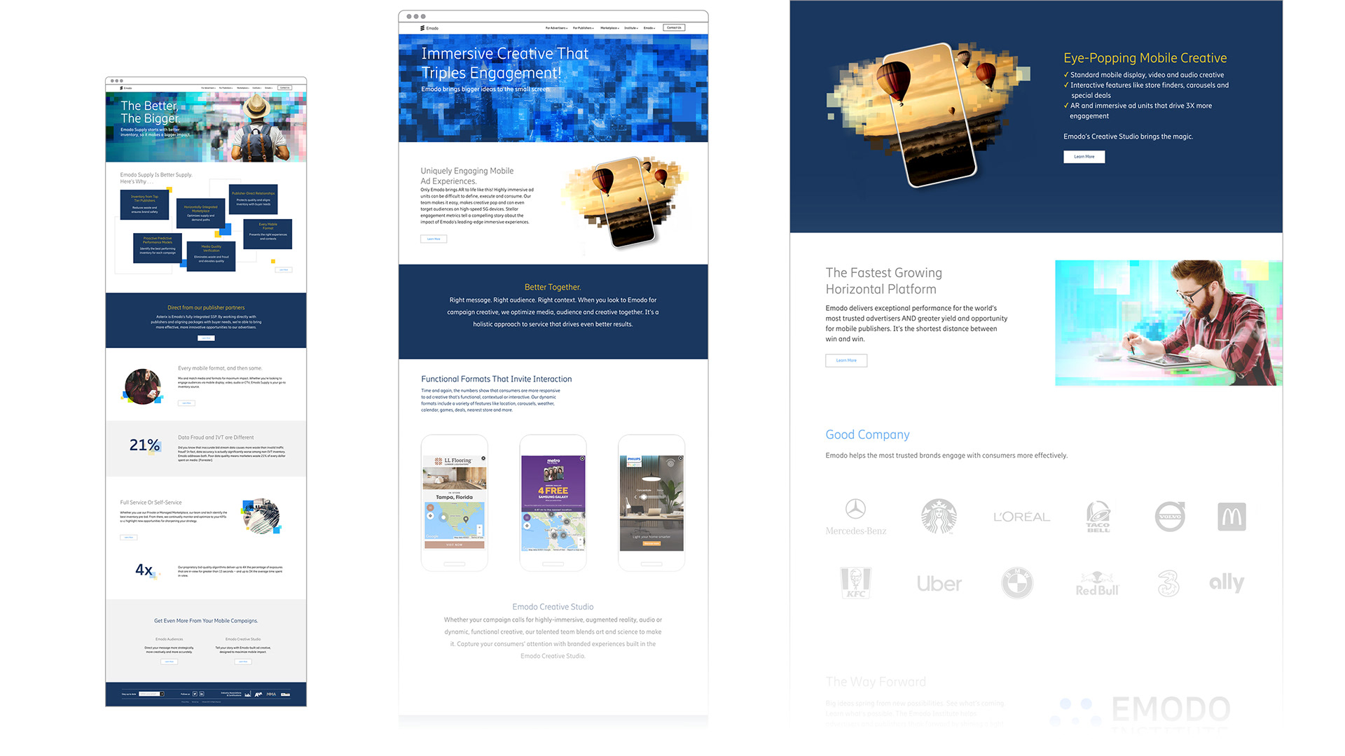


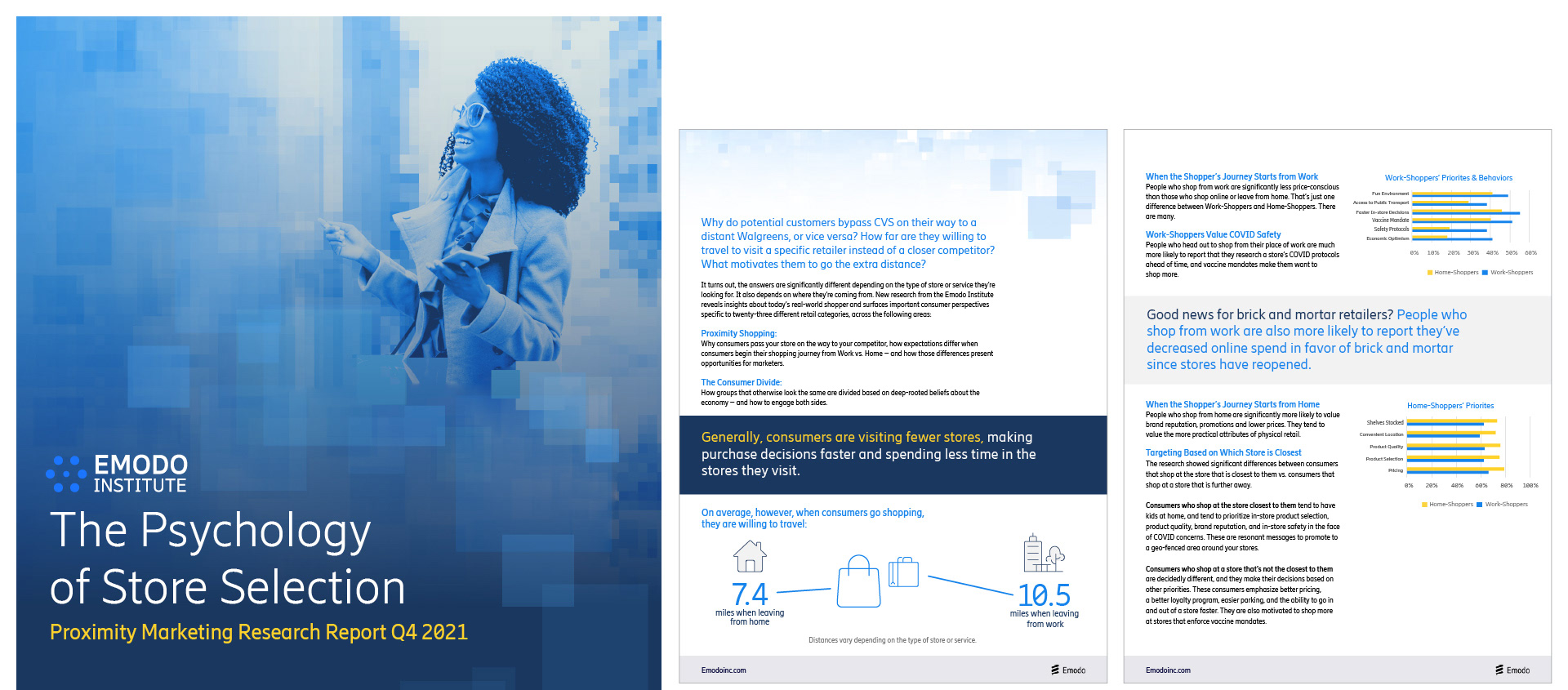
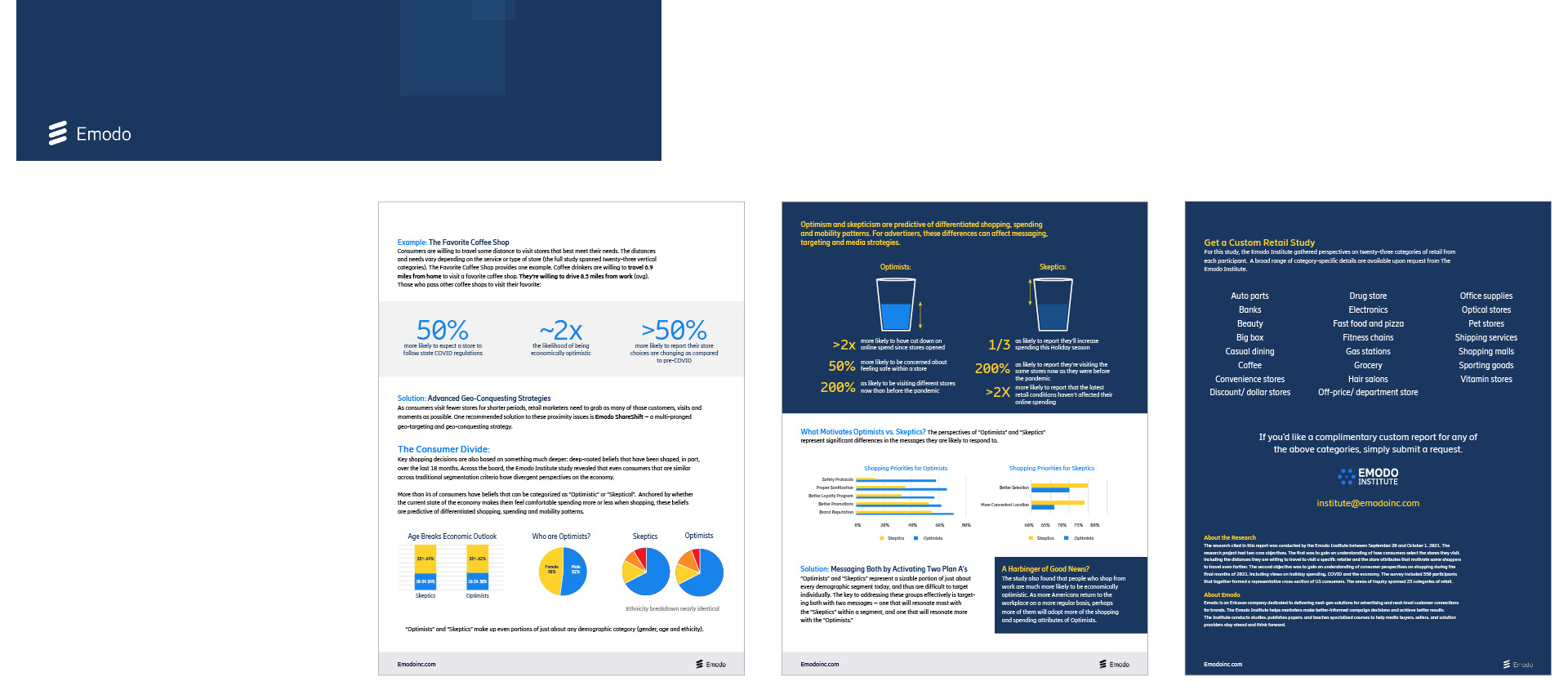
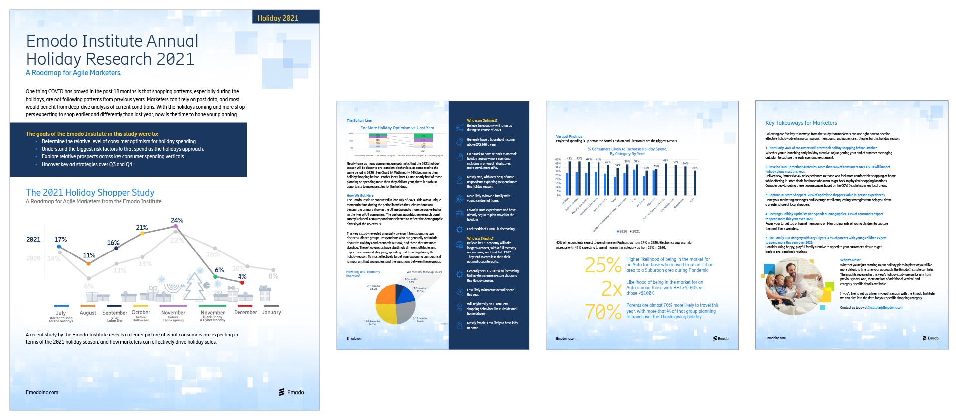
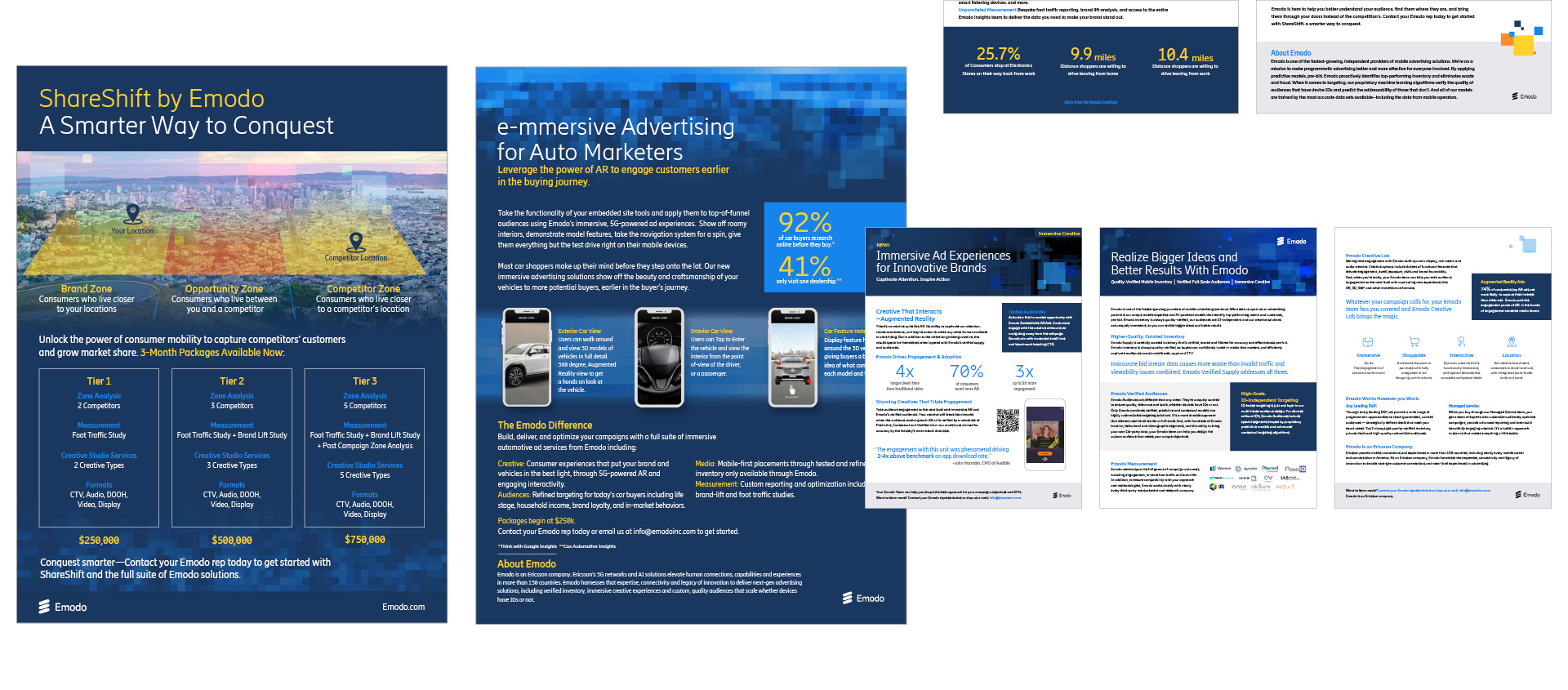
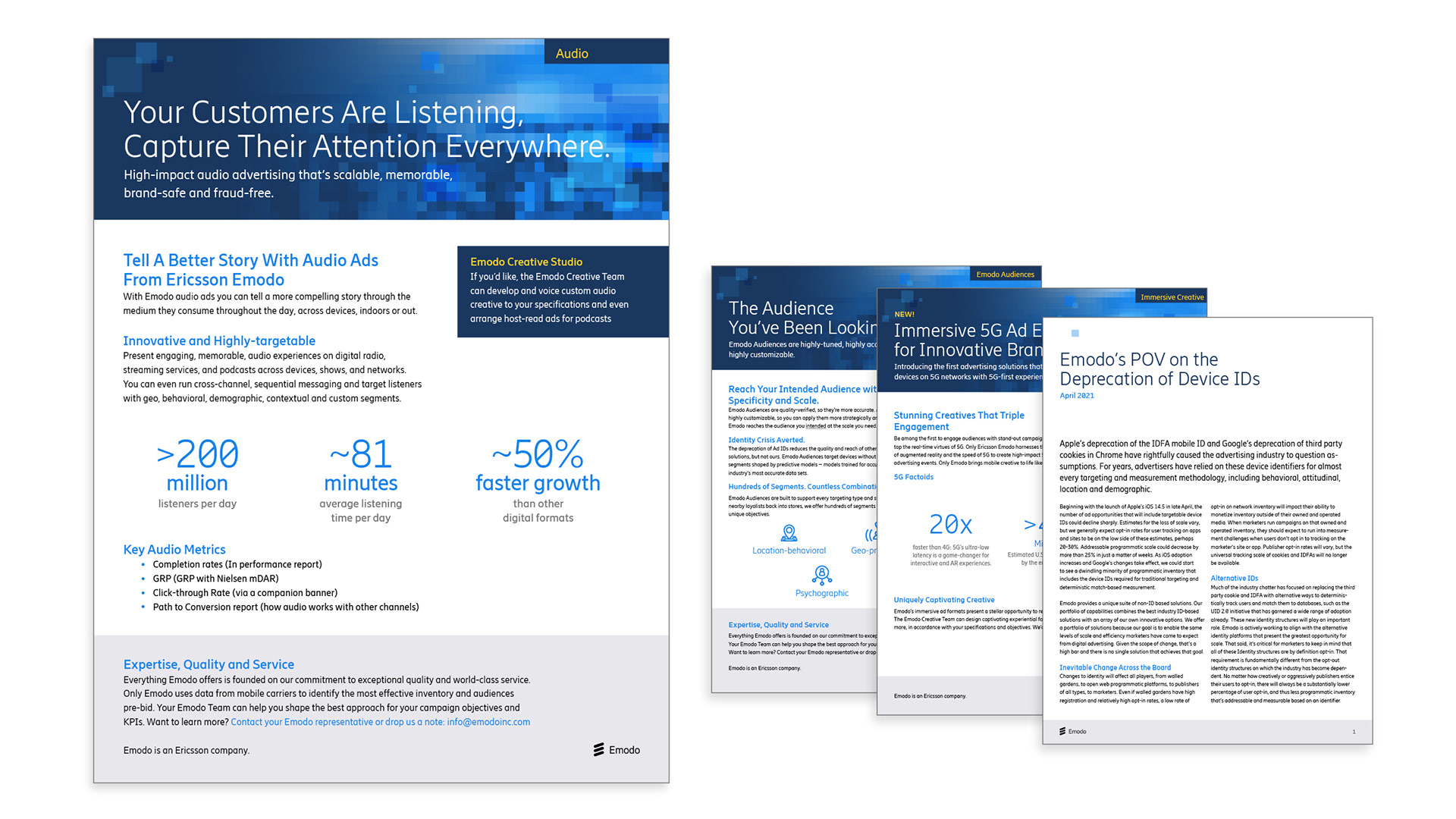
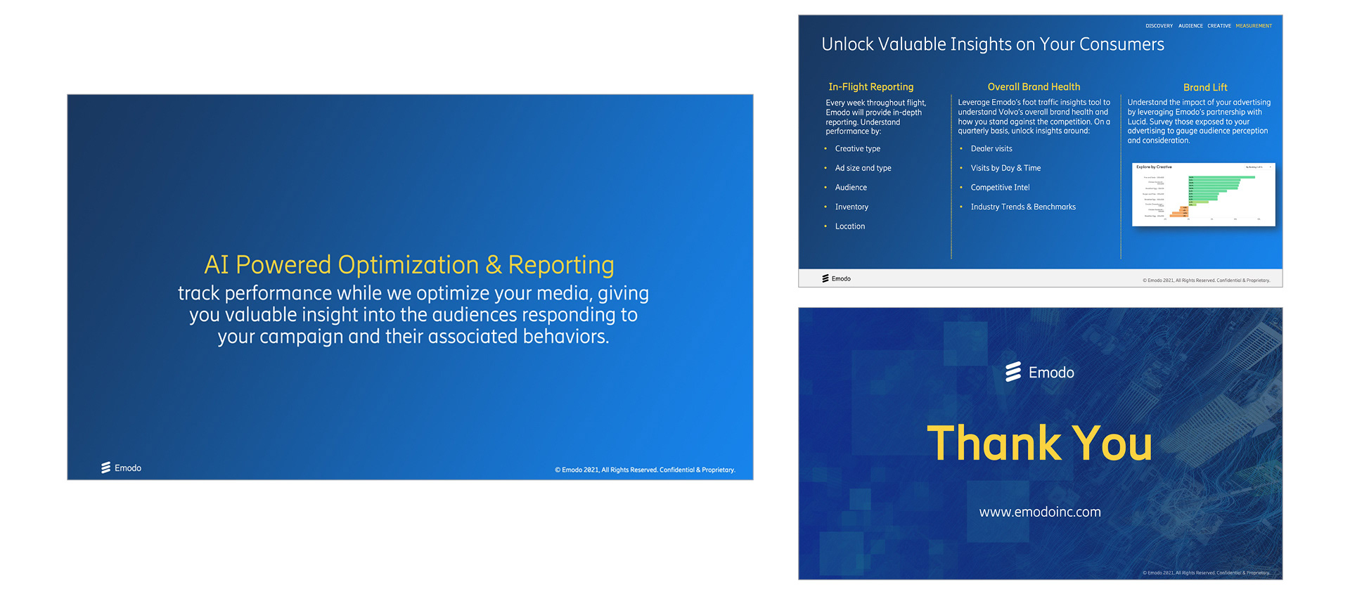
Reports and Sales Sheets One of our main sales leave behinds are digital sales sheets and white-papers. I wanted to keep them consistent with the pixelation them, but eliminate the key subject as it's no longer practical. For this usage, the pixelation became an abstracted background to speak to broader topics.
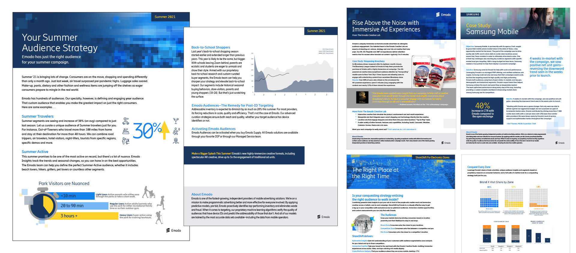
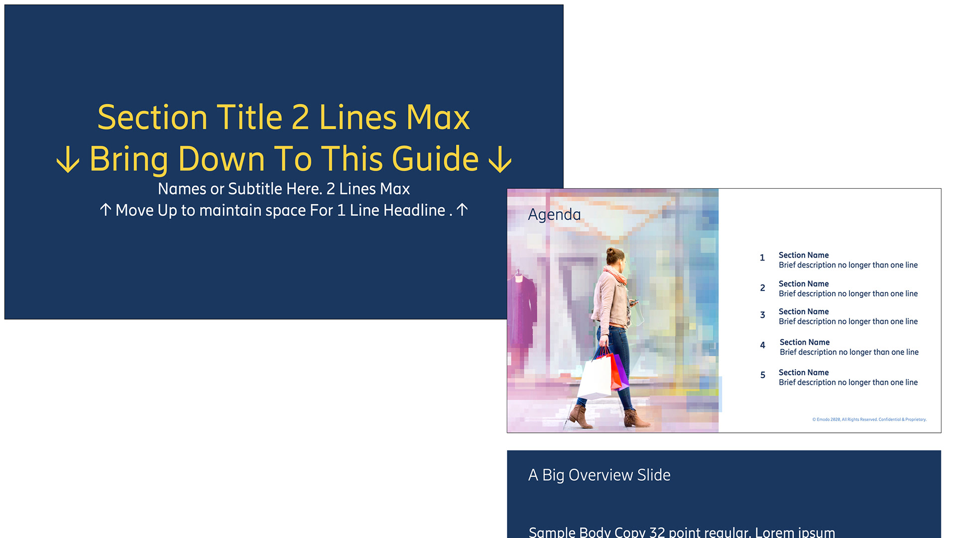
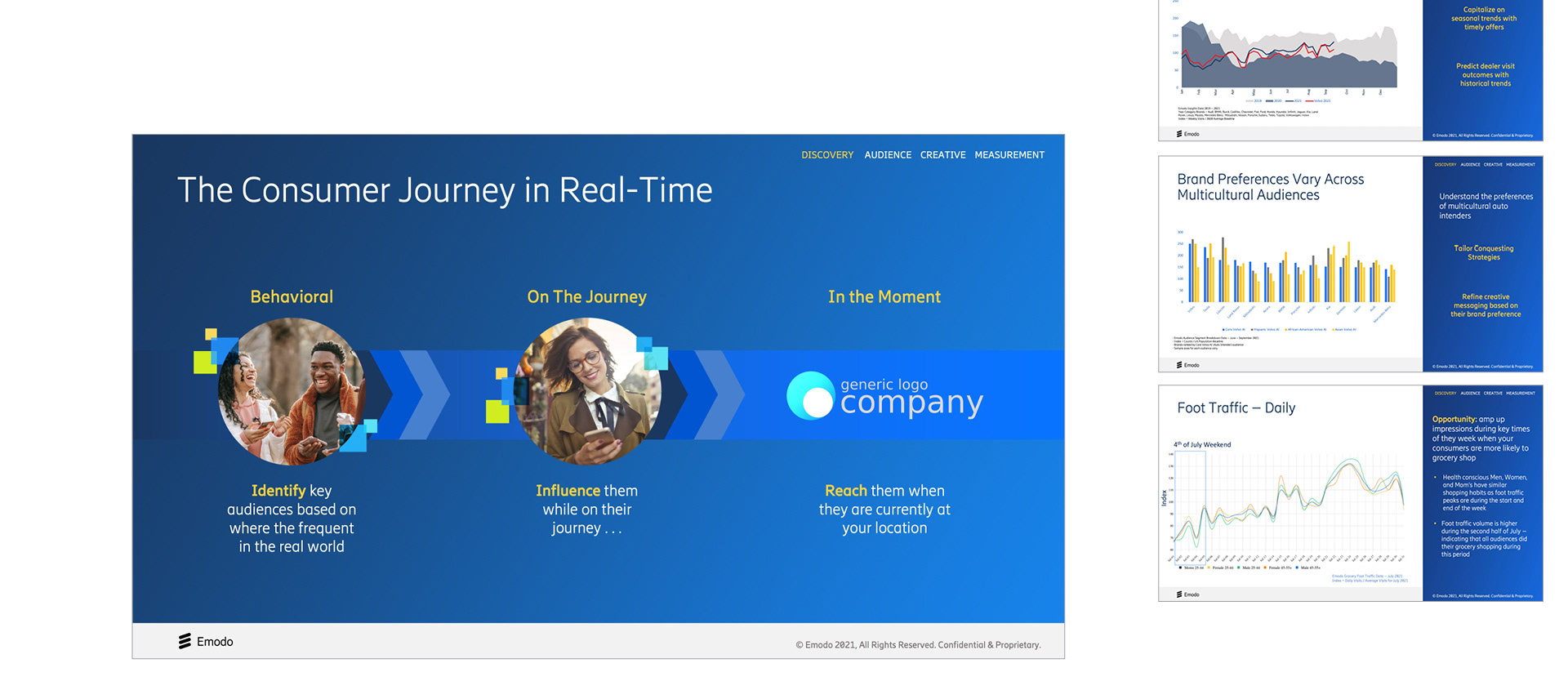
Presentation Decks Our main communication and sales tool, there was a need to create a streamlined powerpoint deck template system that can be used by employees at all levels without needing help from a designer. I've found that guidelines and templates aren't enough, and using instructions and tips instead of greek filler copy is an effective way to demonstrate the how's and why's of the template design guidelines.
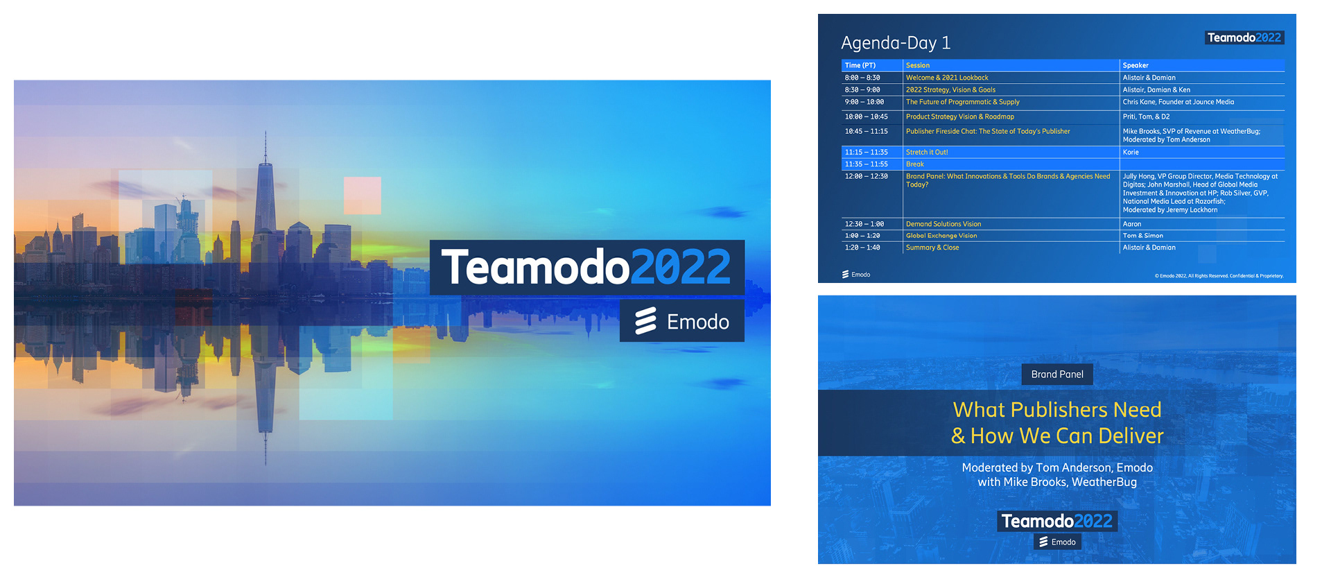
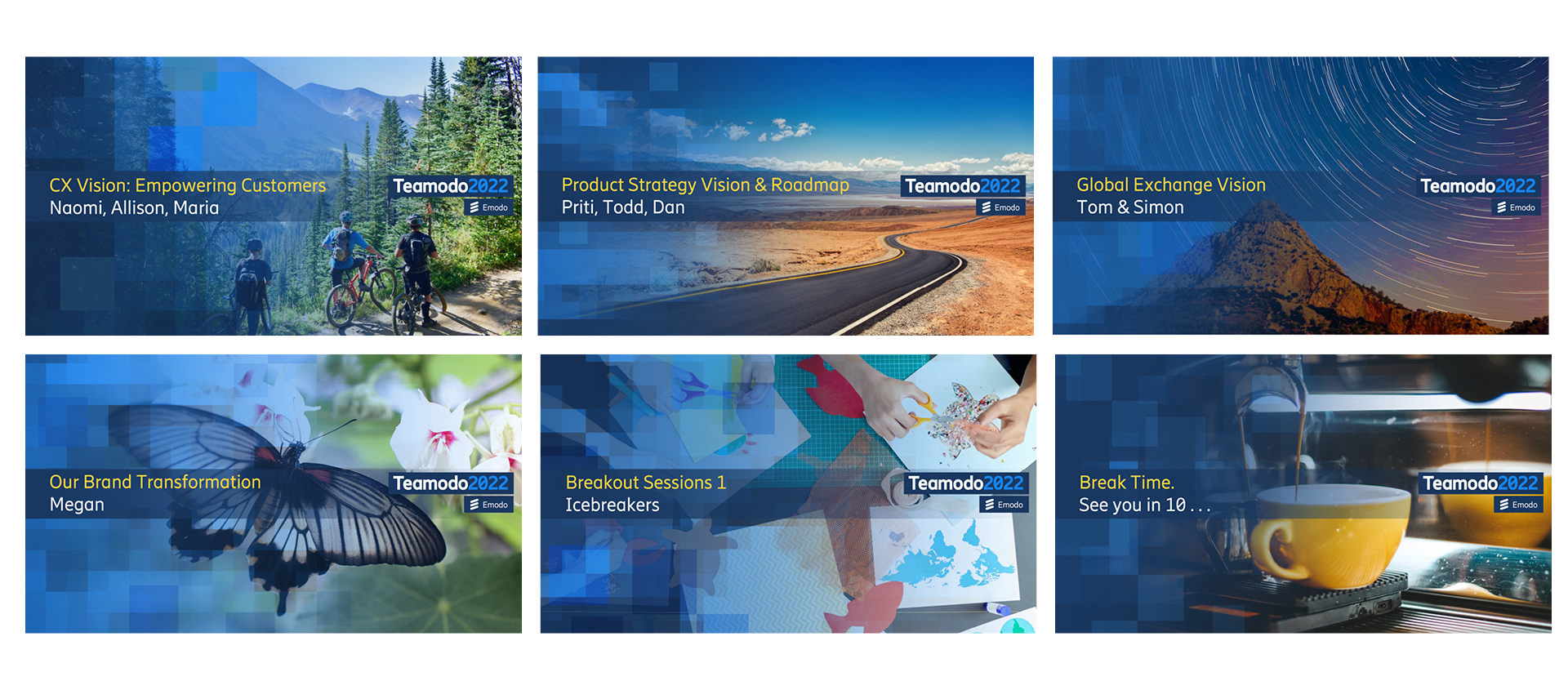
Company Kickoff Event Deck A starter deck to distribute to teams full of frontmatter and divider slides for our annual company kickoff event. Using the theme of "Transformation" I focussed on leveraging our default brand kit to be a little glossy-er than usual, and adding bold imagery that could. help inspire and get the company aligned on our focus and purpose for the upcoming year.
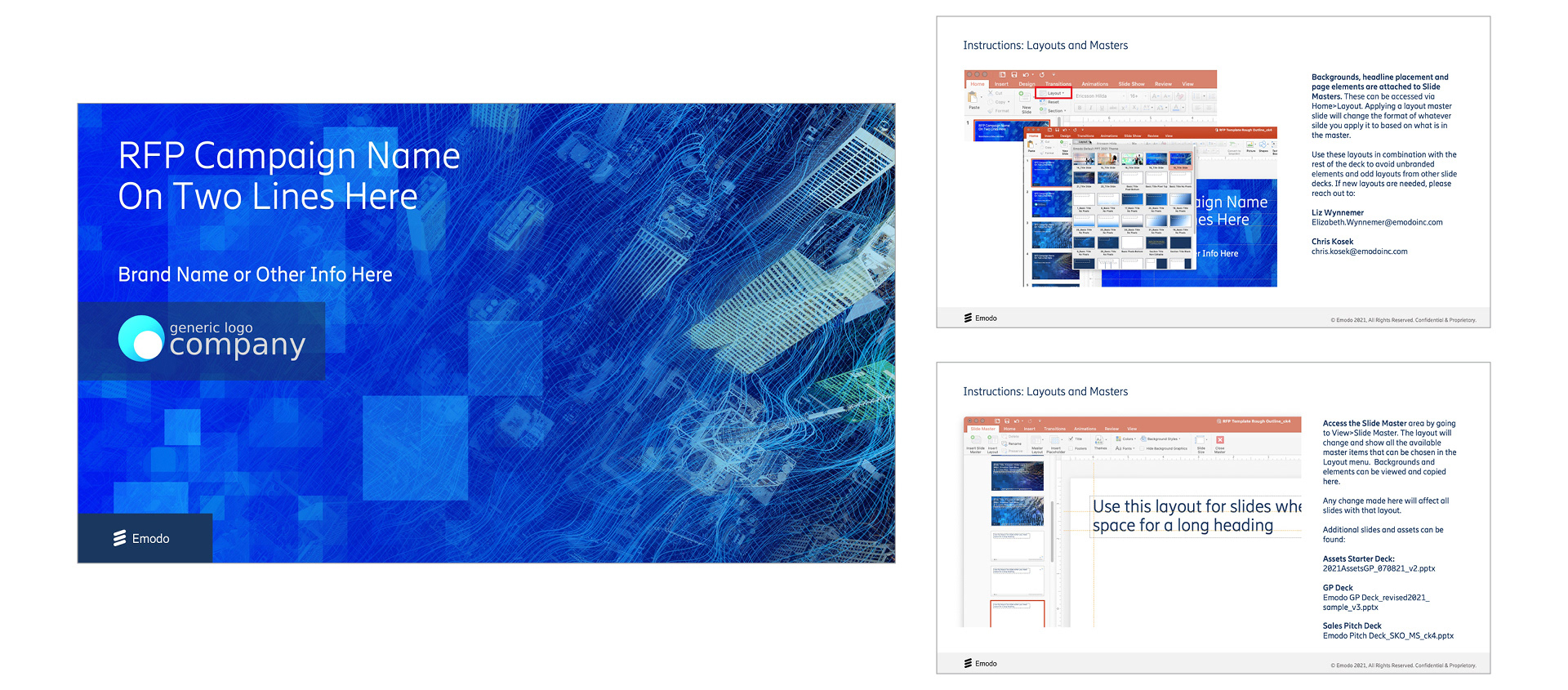
RFP Sales Deck-A PowerPoint Template developed for the Sales Team to specifically chase new business RFPs, optimized for fast, all in one production with plug and play content. The Frontmatter contains prewritten and designed company information, while the Backmatter contains Images that can be used throughout the deck. The goal was to enable the sales team to create high quality design materials on their own and eliminate the need to create bespoke decks for each new opportunity. Usually working in 3-4 day turnaround windows where collaborating with a Designer and the Marketing team wasn't practical.
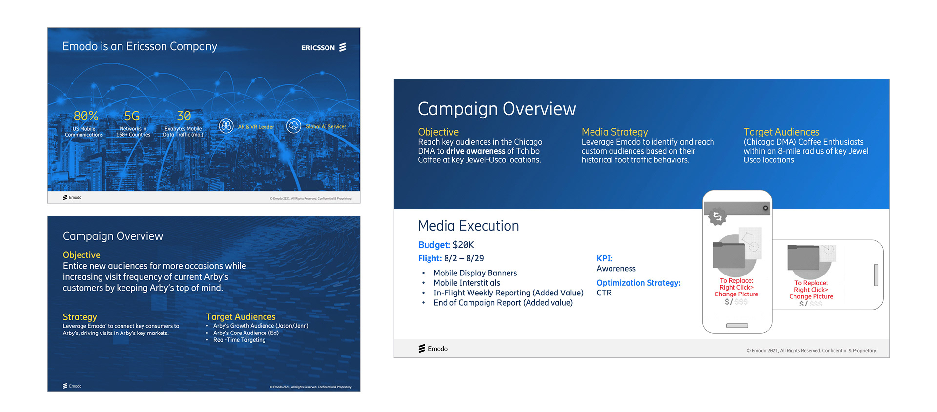
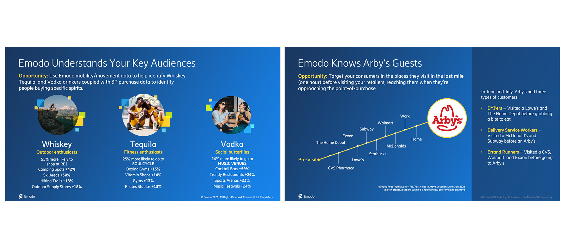
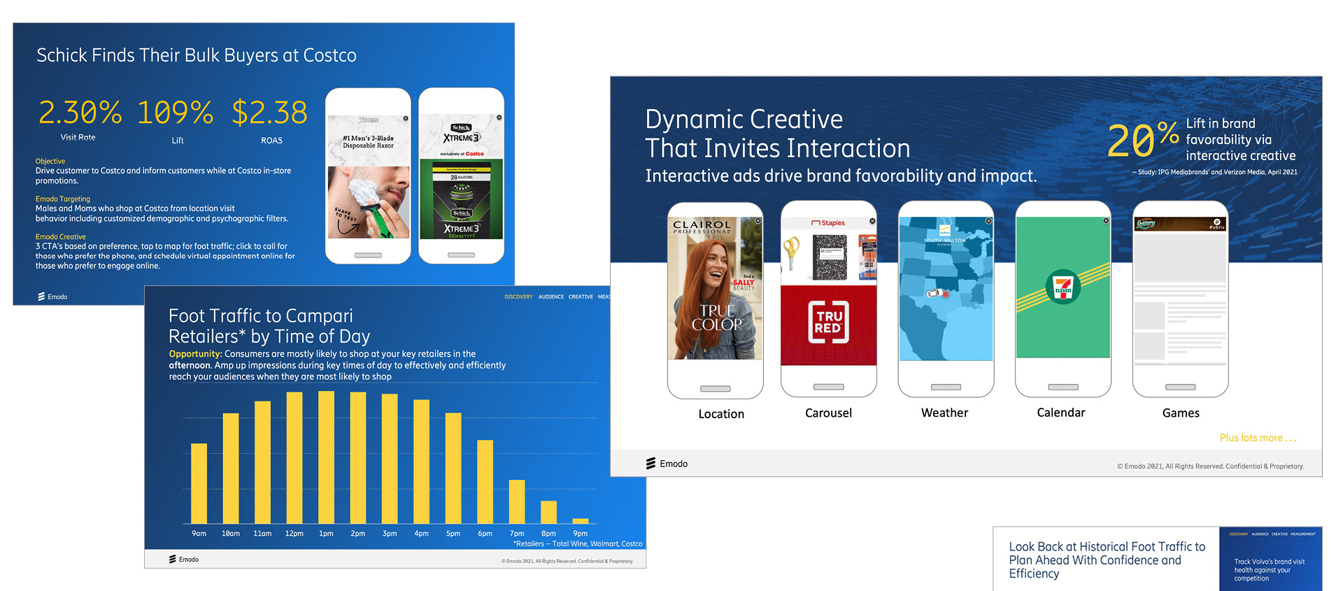
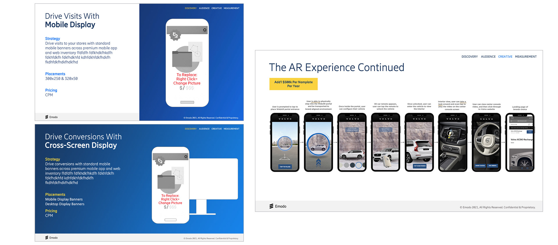
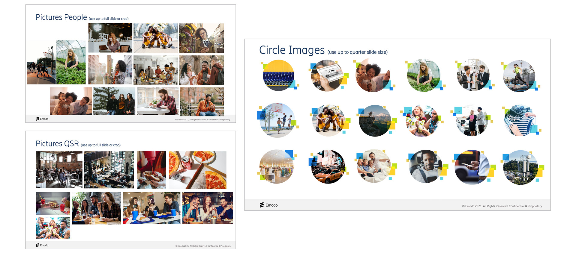

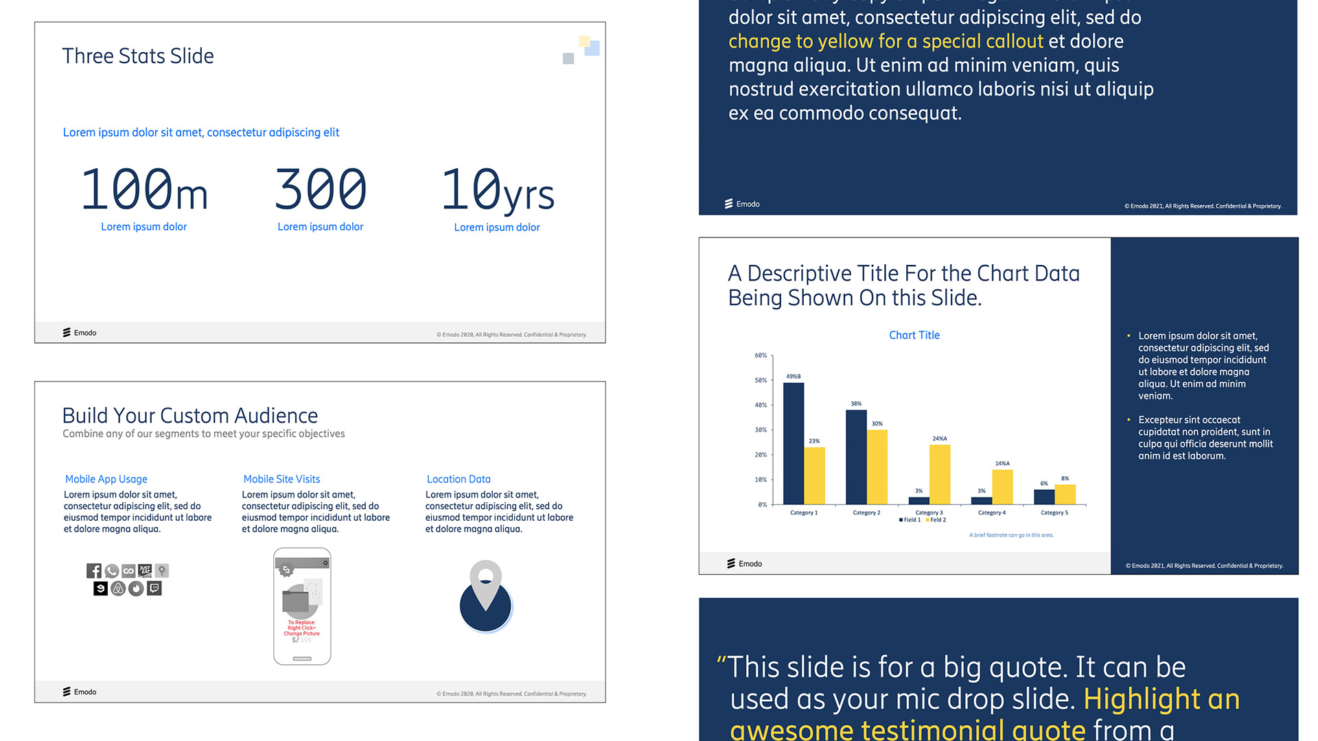
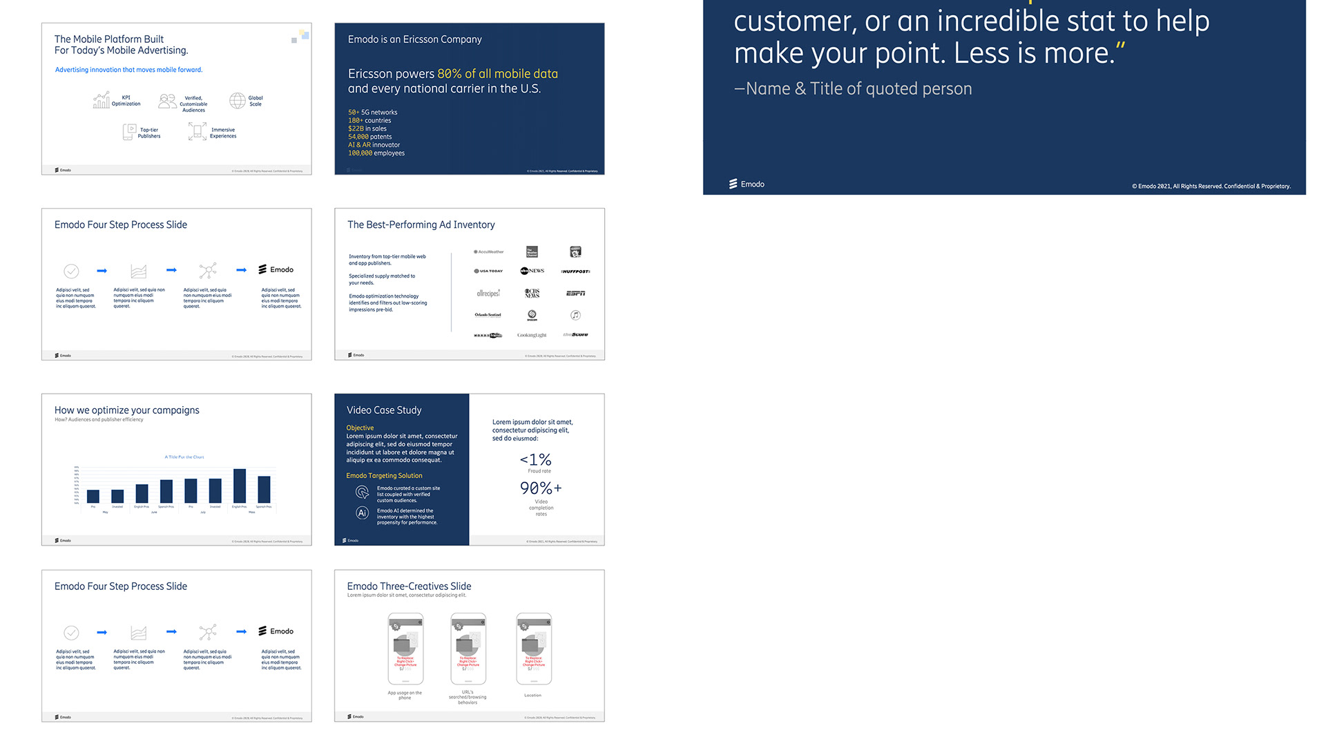
Presentation Deck Asset Pack This is a separate kit meant to work in tandem with the main deck and updated frequently. It contains icons, hero images and support images, as well as basic color, and typography guides. I wrote additional copy in lieu of filler greeked in text giving instruction, tips and background to the brand concept.

Sub Brands